CSS
Media Queries
Media queries are used when the site or app need to be modified according to a device’s general type.
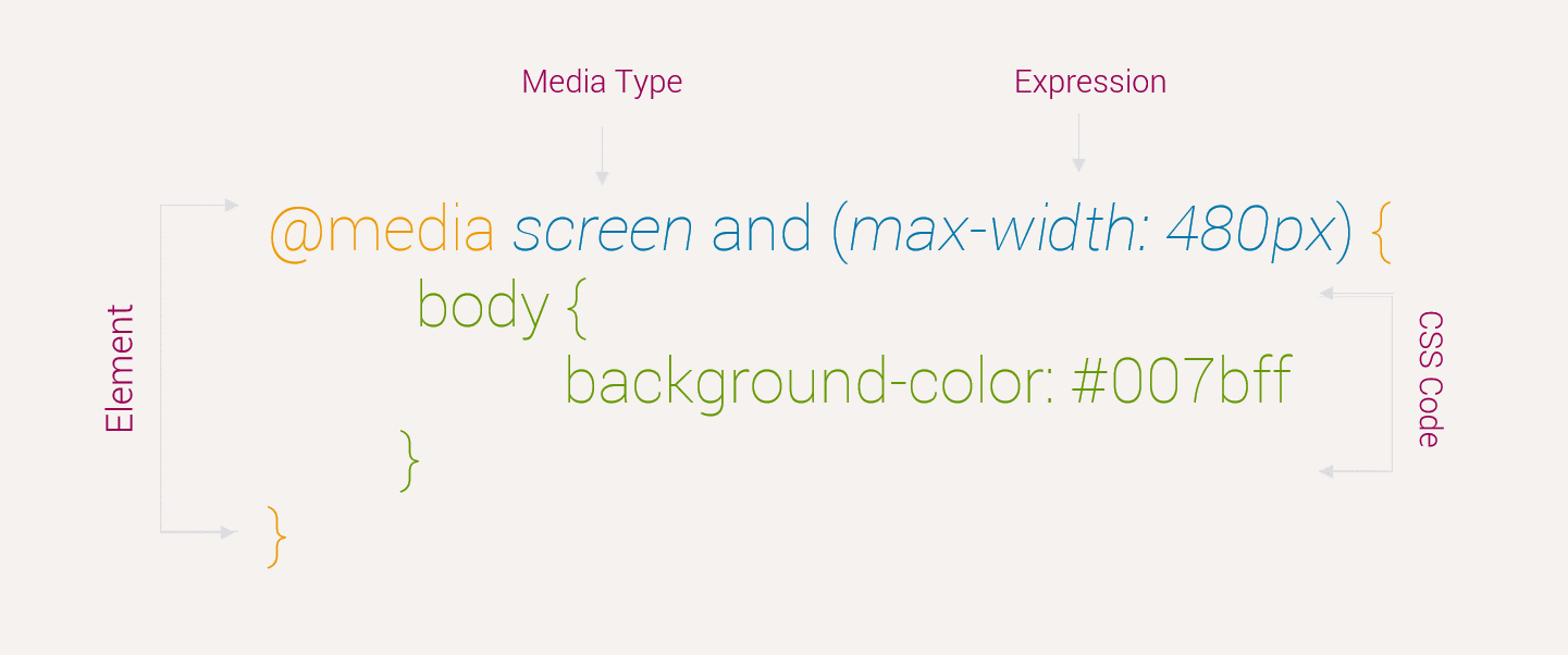
Media Query Breakdown
Here is the breakdown of Media Queries

Media Query Example
Below example will demonstrate the basic architecture of Media Queries
<!doctype html>
<html>
    <head>
        <title>...</title>
        <style>
            @media screen and (min-width: 480px) {
                body {
                    background-color: #007bff;
                }
            }

          @media screen and (min-width: 600px) {
              body {
                  background-color: #343a40;
                  color: #fff;
              }
          }
        </style>
    </head>

    <body>
        $lt;h1>PHPDocs$lt;/h1>
        $lt;p>Resize the window and see the magic$lt;/p>
    </body>
</html>