CSS
Media Queries

Media queries are used when the site or app need to be modified according to a device’s general type.

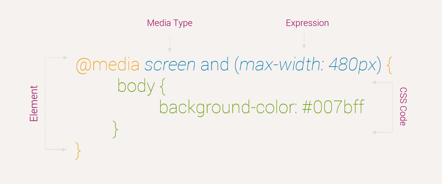
Media Query Breakdown

Here is the breakdown of Media Queries

Media Query Example

Below example will demonstrate the basic architecture of Media Queries

<!doctype html>  
<html>
    <head>
        <title>...</title>
        <style> 
            @media screen and (min-width: 480px) {
                body {
                    background-color: #007bff;
                }
            }  

          @media screen and (min-width: 600px) {
              body {
                  background-color: #343a40;
                  color: #fff;
              }
          }
        </style> 
    </head>
  
    <body>
        $lt;h1>PHPDocs$lt;/h1>
        $lt;p>Resize the window and see the magic$lt;/p>
    </body>
</html>

CSS
Pagination

Pagination links allow users to surf through the content easily by dividing the document into pages and providing them with numbers.

Pagination Example


<!doctype html>  
<html>
    <head>
        <title>...</title>
        <style> 
            .pagination { 
                display: inline-block; 
            } 

            .pagination a { 
                font-weight:bold; 
                font-size:20px; 
                color: black; 
                float: left; 
                padding: 8px 16px; 
                text-decoration: none; 
            } 
            .pagination a.active { 
                background-color:#009900; 
            } 
            .pagination a:hover:not(.active) { 
                background-color: #d4d5d2; 
            } 
            .GFG { 
                font-size:42px; 
                font-weight:bold; 
                color:#009900; 
                margin-left:100px; 
                margin-bottom:60px; 
            } 
            .peg { 
                font-size:24px; 
                font-weight:bold; 
                margin-left:90px; 
                margin-bottom:20px; 
            } 
        </style> 
    </head>
  
    <body>
        <div class="pagination"> 
            <a href="#">«</a> 
            <a href="#">1</a> 
            <a href="#">2</a> 
            <a href="#">3</a> 
            <a href="#">4</a> 
            <a class = "active" href="#">5</a> 
            <a href="#">6</a> 
            <a href="#">7</a> 
            <a href="#">8</a> 
            <a href="#">9</a> 
            <a href="#">10</a> 
            <a href="#">»</a> 
        </div> 
    </body>
</html>

CSS
Buttons

Here are some ways to style buttons in CSS.

Buttons

PropertySyntaxOutput
Button Color.button {background-color: #343a40;}
Button Size.button {font-size: 20px;}
Rounded Button.button {border-radius: 4px;}
Button with Colored Borders.button {border: 2px solid #4CAF50;}
Hoverable Button.button:hover {background-color: #4CAF50; }
Shadow Button.button {box-shadow: 0 8px 16px 0 rgba(0,0,0,0.2),
0 6px 20px 0 rgba(0,0,0,0.19);}
Disabled Button.button {background-color: #343a40;}


CSS
Transitions & Animations

CSS property transitions allow the appearance and behavior of an element to be altered in multiple ways.

Transition Property

The transition-property determines what properties will be transitioned.

ValueDescription
BackgroundIt only transitions the background property
ColorIt only transitions the color property
TransformIt only transitions the transform property
AllIt transitions all the properties
NoneThe transition is instant as the element transitions no property

Example:

<!doctype html>  
<html>
    <head>
        <title>...</title>

        <style type="text/css">
            .box {
                background: #2db34a;
                border-radius: 6px
                transition-property: background, border-radius;
                transition-duration: 1s;
                transition-timing-function: linear;
            }
            .box:hover {
                background: #ff7b29;
                border-radius: 50%;
            }
        </style>
    </head>
  
    <body>
        <div class="box">Box</div>
    </body>
</html>

Transition Duration

The transition-duration property set the duration in which a transition takes place. The value of this property can be set using general timing values, including seconds (s) and milliseconds (ms).

ValueDescription
0sThe transition is instant as the element transitions no property
1.2sIt uses decimal values in seconds with the keyword “s”
2400msIt uses decimal values in milliseconds with the keyword “ms”

Example:

<!doctype html>  
<html>
    <head>
        <title>...</title>

        <style type="text/css">
            .box {
                background: #2db34a;
                border-radius: 6px;
                transition-property: background, border-radius;
                transition-duration: .2s, 1s;
                transition-timing-function: linear;
            }
            .box:hover {
                background: #ff7b29;
                border-radius: 50%;
            }
        </style>
    </head>
  
    <body>
        <div class="box">Box</div>
    </body>
</html>

Transition Time

The CSS property transition-timing-function is used to set the speed in which a transition will move.

ValueDescription
easeIt starts slowly, accelerates in the middle, and slows down at the end
ease-inIt starts slowly, and accelerates gradually until the end
ease-outIt starts quickly, and decelerates gradually until the end
ease-in-outIt starts quickly, and decelerates gradually until the end
linearIt has a *constant speed
step-startIt jumps instantly to the final state
step-endIt stays at the initial state until the end, when it instantly jumps to the final state

Example:

<!doctype html>  
<html>
    <head>
        <title>...</title>

        <style type="text/css">
            .box {
                background: #2db34a;
                border-radius: 6px;
                transition-property: background, border-radius;
                transition-duration: .2s, 1s;
                transition-timing-function: linear, ease-in;
            }
            .box:hover {
                background: #ff7b29;
                border-radius: 50%;
            }

        </style>
    </head>
  
    <body>
        <div class="box">Box</div>
    </body>
</html>

Transition Delay

CSS transition propert delay sets a time value, seconds or milliseconds, that determines how long a transition will take time before execution.

ValueDescription
0sIt will wait zero seconds, and thus start right away
1.2sIt uses decimal values in seconds with the keyword “s”
2400msIt uses decimal values in milliseconds with the keyword “ms”
-500msIt uses negative values so the transition will start as if it had already been playing for 500ms.

Example:

<!doctype html>  
<html>
    <head>
        <title>...</title>

        <style type="text/css">
            .box {
                background: #2db34a;
                border-radius: 6px
                transition-property: background, border-radius;
                transition-duration: .2s, 1s;
                transition-timing-function: linear, ease-in;
                transition-delay: 0s, 1s;
            }
            .box:hover {
                background: #ff7b29;
                border-radius: 50%;
            }

        </style>
    </head>
  
    <body>
        <div class="box">Box</div>
    </body>
</html>


CSS
Gradients

CSS provides facility of gradients displays the combination of two or more colors.

There are two main types of gradients:

  • Linear Gradients
  • Radial Gradients

Top to Bottom

Code

<!doctype html>  
<html>
  <head>
    <title>...</title>
      <style type="text/css">
        #grad1 {
            height: 220px;
            background: linear-gradient(#343a40,#007bff);
            width: 288px;
         }
    </style>
  </head>
  
  <body>
      <div id = "grad1"></div>
  </body>
</html>

Left to Right

Code

<!doctype html>  
<html>
  <head>
    <title>...</title>
      <style type="text/css">
        #grad1 {
            height: 220px;
            background: linear-gradient(to right, 343a40 , 007bff);
            width: 288px;
         }
    </style>
  </head>
  
  <body>
      <div id = "grad1"></div>
  </body>
</html>

Diagonal

Code

<!doctype html>  
<html>
  <head>
    <title>...</title>
      <style type="text/css">
        #grad1 {
            height: 220px;
            background: linear-gradient(to bottom, #343a40, #007bff);
            width: 288px;
         }
    </style>
  </head>
  
  <body>
      <div id = "grad1"></div>
  </body>
</html>

Multi Color

Code

<!doctype html>  
<html>
  <head>
    <title>...</title>
      <style type="text/css">
        #grad1 {
            height: 220px;
            background: linear-gradient(#343a40 , #00a6d6, #ba2981, #ff0000);
            width: 288px;
         }
    </style>
  </head>
  
  <body>
      <div id = "grad1"></div>
  </body>
</html>

Radial Gradients

Code

<!doctype html>  
<html>
  <head>
    <title>...</title>
      <style type="text/css">
        #grad1 {
            height: 220px;
            background: radial-gradient(#343a40 5%, #007bff 15%, #ba2981 60%);
            width: 288px;
         }
    </style>
  </head>
  
  <body>
      <div id = "grad1"></div>
  </body>
</html>

Repeat Radial Gradients

Code

<!doctype html>  
<html>
  <head>
    <title>...</title>
      <style type="text/css">
        #grad1 {
            height: 220px;
            background: repeating-radial-gradient(#343a40, #007bff 10%, #ba2981 15%);
            width: 288px;
         }
    </style>
  </head>
  
  <body>
      <div id = "grad1"></div>
  </body>
</html>


CSS
Navigation Bar

Here are some steps to create navigation bar using HTML and CSS.

HTML Steps

Below elements need to be created in HTML.

  • Nav element i.e. <nav>
  • List tag i.e. <ul>
  • list items i.e. <li>
  • a link tag i.e. <a>

Put the values in tag.

<nav>
    <ul>
        <li class="home"><a href="#">Home</a></li>
        <li class="about"><a href="#">About</a></li>
        <li class="about"><a href="#">HTML</a></li>
        <li class="news"><a href="#"><a class="active" href="#">CSS</a></li>
        <li class="contact"><a href="#">Contact</a></li>
    </ul>
</nav>

CSS Styling

Styling <ul>

<style type="text/css">
    nav ul {
        list-style: none;
        background-color: #343a40;
        text-align: center;
        padding: 0;
        margin: 0;
    }
</style>

Styling <li>

              
<style type="text/css">
    nav li {
        font-family: 'Oswald', sans-serif;
        font-size: 3.2em;
        line-height: 40px;
        height: 40px;
        border-bottom: 1px solid #888;
    }  
</style>

Styling <a>

<style type="text/css">
    nav a {
        text-decoration: none;
        color: #fff;
        display: block;
        transition: .3s background-color;
    }
             
    nav a:hover {
        background-color: #007bff;
    }
             
    nav a.active {
        background-color: #fff;
        color: #444;
        cursor: default;
    } 
</style>

Making navigation responsive

<style type="text/css">
    @media screen and (min-width: 600px) {
        nav li {
            width: 120px;
            border-bottom: none;
            height: 50px;
            line-height: 50px;
            font-size: 1.4em;
        }

        nav li {
            display: inline-block;
            margin-right: -4px;
        }
    }
</style>

Complete Code for Navigation Bar

<!doctype html>  
<html>
<head>
    <title>Testing</title>

    <style type="text/css">

        nav ul {
            list-style: none;
            background-color: #343a40;
            text-align: center;
            padding: 0;
            margin: 0;
        }
        nav li {
            font-family: 'Oswald', sans-serif;
            font-size: 1.2em;
            line-height: 40px;
            height: 40px;
            border-bottom: 1px solid #888;
        }
         
        nav a {
            text-decoration: none;
            color: #fff;
            display: block;
            transition: .3s background-color;
        }
         
        nav a:hover {
            background-color: #007bff;
        }
         
        nav a.active {
            background-color: #fff;
            color: #444;
            cursor: default;
        }
         
        @media screen and (min-width: 600px) {
            nav li {
                width: 120px;
                border-bottom: none;
                height: 50px;
                line-height: 50px;
                font-size: 1.4em;
            }

            nav li {
                display: inline-block;
                margin-right: -4px;
            }
         
        }


    </style>
</head>

<body>
  <header>
    <nav>
      <ul>
        <li class="home"><a href="#">Home</a></li>
        <li class="about"><a href="#">About</a></li>
        <li class="about"><a href="#">HTML</a></li>
        <li class="news"><a href="#"><a class="active" href="#">CSS</a></li>
        <li class="contact"><a href="#">Contact</a></li>
      </ul>
    </nav>
  </header>
</body>
</body>
</html>

CSS
Lists

CSS can be used to customize the style of list elements.

list-style-type

CSS property list-style-type is used to specify the type of list-item marker. Default value is “disc”.

Properties

Some of the types that can be used for list element styling are as follows:

  • list-style-type: circle;
  • list-style-type: square;
  • list-style-type: upper-roman;
  • list-style-type: lower-alpha;
Example:

<!doctype html>  
<html>
    <head>
        <title>...</title>
        <style> 
            ul.circle {
                list-style-type: circle;
            }
        </style> 
    </head>
  
    <body>
        <p>PHPDocs provides the tutorials of following languages.</p>

        <ul class="circle">
          <li>HTML</li>
          <li>CSS</li>
          <li>PHP</li>
        </ul>
    </body>
</html>

list-style-position

CSS property list-style-position is used to specify where to place the list-item marker. Default value is “outside”

Properties

Some of the positions that can be used for list element styling are as follows:

  • list-style-position: circle;
  • list-style-position: square;
Example:

<!doctype html>  
<html>
    <head>
        <title>...</title>
        <style> 
            ul.inside {
                list-style-position: inside;
            }
        </style> 
    </head>
  
    <body>
        <p>PHPDocs provides the tutorials of following languages.</p>

        <ul class="inside">
          <li>HTML</li>
          <li>CSS</li>
          <li>PHP</li>
        </ul>
    </body>
</html>

list-style-image

CSS property list-style-type is used to replace the list-item marker with an image.

Example:

<!doctype html>  
<html>
    <head>
        <title>...</title>
        <style> 
            ul {
                list-style-image: url('sqpurple.gif');
            }
        </style> 
    </head>
  
    <body>
        <p>PHPDocs provides the tutorials of following languages.</p>

        <ul>
          <li>HTML</li>
          <li>CSS</li>
          <li>PHP</li>
        </ul>
    </body>
</html>

CSS
Icons

The CSS allows the user to add icons on web page.

Font Awesome is an icon library through which icons can be added to a web page easily.

Add the name of the specified icon class to any inline HTML element (like <i> or <span>).

Bootstrap Icons

Link:

<link rel="stylesheet" href="https://maxcdn.bootstrapcdn.com/bootstrap/3.3.7/css/bootstrap.min.css">

Syntax:

<i class="glyphicon glyphicon-cloud" style="font-size:48px;"></i>

Example:

<!doctype html>  
<html>
    <head>
        <title>...</title>
        <meta name="viewport" content="width=device-width, initial-scale=1">
        <link rel="stylesheet" href="https://maxcdn.bootstrapcdn.com/bootstrap/3.3.7/css/bootstrap.min.css">
    </head>
  
    <body>
      <i class="glyphicon glyphicon-cloud" style="font-size:48px;"></i>
    </body>
</html>

Font Awsome Icons

Link:

<link rel="stylesheet" href="https://use.fontawesome.com/releases/v5.7.0/css/all.css" integrity="sha384-lZN37f5QGtY3VHgisS14W3ExzMWZxybE1SJSEsQp9S+oqd12jhcu+A56Ebc1zFSJ" crossorigin="anonymous">
              

Syntax:

<i class="fas fa-cloud"></i>

Example:

<!doctype html>  
<html>
    <head>
        <title>...</title>
        <meta name="viewport" content="width=device-width, initial-scale=1">
        <link rel="stylesheet" href="https://use.fontawesome.com/releases/v5.7.0/css/all.css" integrity="sha384-lZN37f5QGtY3VHgisS14W3ExzMWZxybE1SJSEsQp9S+oqd12jhcu+A56Ebc1zFSJ" crossorigin="anonymous">
    </head>
  
    <body>
      <i class="fas fa-cloud"></i>
    </body>
</html>

Google Icons

Link:

                <meta name="viewport" content="width=device-width, initial-scale=1">
                <link rel="stylesheet" href="https://fonts.googleapis.com/icon?family=Material+Icons">

Syntax:

lt;i class="material-icons" style="font-size:36px;">cloud</i>

Example:

<!doctype html>  
<html>
    <head>
        <title>...</title>
        <meta name="viewport" content="width=device-width, initial-scale=1">
        <link rel="stylesheet" href="https://fonts.googleapis.com/icon?family=Material+Icons">
    </head>
  
    <body>
      <i class="glyphicon glyphicon-cloud" style="font-size:48px;"></i>
    </body>
</html>

CSS
Overflow

The overflow property is used to tell the browser what to do with content that doesn’t fit in a box.

Overflow Properties

The most commonly used values for this property are as follows:

ValueDescriptionSyntax
hiddenIt hides overflowing contentoverflow: hidden;
visibleThe content of an element flows out of the boxoverflow: visible;
scrollIt displays scrollbars whether or not any content is actually clipped.overflow: scroll;
autoIf the content proceeds outside its box then that content will be hidden whilst a scroll bar should be visible for users to read the rest of the content.overflow: auto;

Overflow Example

Below examples will demonstrate the basic architecture of border

Example:

<!doctype html>  
<html>
    <head>
        <title>...</title>
        <style type="text/css">
          .overflow {
            background-color: #f5f2f0;
            width: 50%;
            height: 90%;
            overflow: scroll;
          }
        </style>
    </head>
  
    <body>
      <div class="overflow">Lorem ipsum dolor sit amet, consectetuer adipiscing elit, sed diam nonummy nibh euismod tincidunt ut laoreet dolore magna aliquam erat volutpat.</div>
    </body>
</html>


CSS
Images

CSS allows the user to style the image in different ways.

Text on Image

Code

<!doctype html>  
<html>
  <head>
    <title>...</title>
      <style type="text/css">
        img {
          position: absolute;
          left: 0px;
          top: 0px;
          z-index: -1;
        }
    </style>
  </head>
  
  <body>
    <img src="myimage.png">
    <p>Tutorials for Web Programming</p>
  </body>
</html>

Rounded Image

Code

<!doctype html>  
<html>
  <head>
    <title>...</title>
      <style type="text/css">
        img{
          width: 56%;
          border-radius: 55%;
          height: 50%;
        }
    </style>
  </head>
  
  <body>
    <img src="myimage.png">
  </body>
</html>

Polaroid Image

Code

<!doctype html>  
<html>
  <head>
    <title>...</title>
      <style type="text/css">
        div.polaroid {
          width: 80%;
          margin-bottom: 25px;
          background-color: white;
          box-shadow: 0 4px 8px 0 rgba(0, 0, 0, 0.2), 0 6px 20px 0 rgba(0, 0, 0, 0.19);
        }

        div.caption {
          text-align: center;
          padding: 10px 20px;
        }
    </style>
  </head>
  
  <body>
    <div class="polaroid">
      <img src="img_5terre.jpg" alt="5 Terre" style="width:100%">
        <div class="container">
          <p>Cinque Terre</p>
        </div>
      </div>
  </body>
</html>

Image Transparency

Code

<!doctype html>  
<html>
  <head>
    <title>...</title>
      <style type="text/css">
        img {
          opacity: 0.5;
        }
    </style>
  </head>
  
  <body>
    <img src="myimage.png">
  </body>
</html>