CSS
Gradients
CSS provides facility of gradients displays the combination of two or more colors.
There are two main types of gradients:
- Linear Gradients
- Radial Gradients
Top to Bottom
Code
<!doctype html>
<html>
  <head>
    <title>...</title>
      <style type="text/css">
        #grad1 {
            height: 220px;
            background: linear-gradient(#343a40,#007bff);
            width: 288px;
         }
    </style>
  </head>

  <body>
      <div id = "grad1"></div>
  </body>
</html>
Left to Right
Code
<!doctype html>
<html>
  <head>
    <title>...</title>
      <style type="text/css">
        #grad1 {
            height: 220px;
            background: linear-gradient(to right, 343a40 , 007bff);
            width: 288px;
         }
    </style>
  </head>

  <body>
      <div id = "grad1"></div>
  </body>
</html>
Diagonal
Code
<!doctype html>
<html>
  <head>
    <title>...</title>
      <style type="text/css">
        #grad1 {
            height: 220px;
            background: linear-gradient(to bottom, #343a40, #007bff);
            width: 288px;
         }
    </style>
  </head>

  <body>
      <div id = "grad1"></div>
  </body>
</html>
Multi Color
Code
<!doctype html>
<html>
  <head>
    <title>...</title>
      <style type="text/css">
        #grad1 {
            height: 220px;
            background: linear-gradient(#343a40 , #00a6d6, #ba2981, #ff0000);
            width: 288px;
         }
    </style>
  </head>

  <body>
      <div id = "grad1"></div>
  </body>
</html>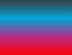
Radial Gradients
Code
<!doctype html>
<html>
  <head>
    <title>...</title>
      <style type="text/css">
        #grad1 {
            height: 220px;
            background: radial-gradient(#343a40 5%, #007bff 15%, #ba2981 60%);
            width: 288px;
         }
    </style>
  </head>

  <body>
      <div id = "grad1"></div>
  </body>
</html>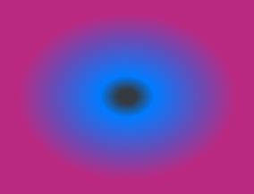
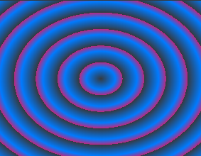
Repeat Radial Gradients
Code
<!doctype html>
<html>
  <head>
    <title>...</title>
      <style type="text/css">
        #grad1 {
            height: 220px;
            background: repeating-radial-gradient(#343a40, #007bff 10%, #ba2981 15%);
            width: 288px;
         }
    </style>
  </head>

  <body>
      <div id = "grad1"></div>
  </body>
</html>